
I’m so used to creating bold designs using bright colors that I forget the there are people who prefer more quiet beauty.
Violets repeat design, in coral-ly pink
I was doing the primary design of this piece, all full of really bright colors and bold strokes. The app I use to draw on only has a few basic colors, so I’m kinda stuck using them. After I have completed the original drawing, I import it into photoshop to modify it.
Here’s the original, just so you can see the comparison.
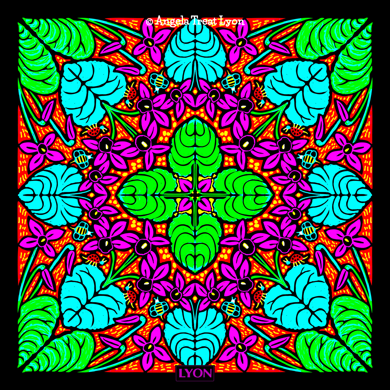
The original design in full color
It then occurred to me to just use black and white to see what it’d look like.
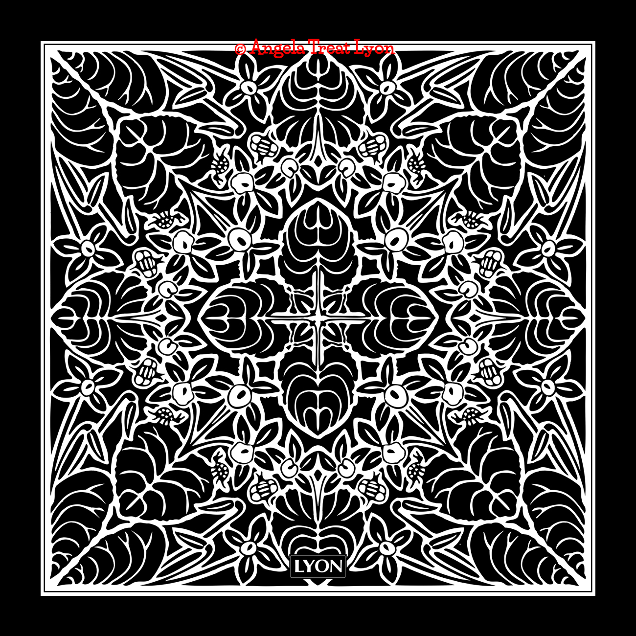
Violets in black and white
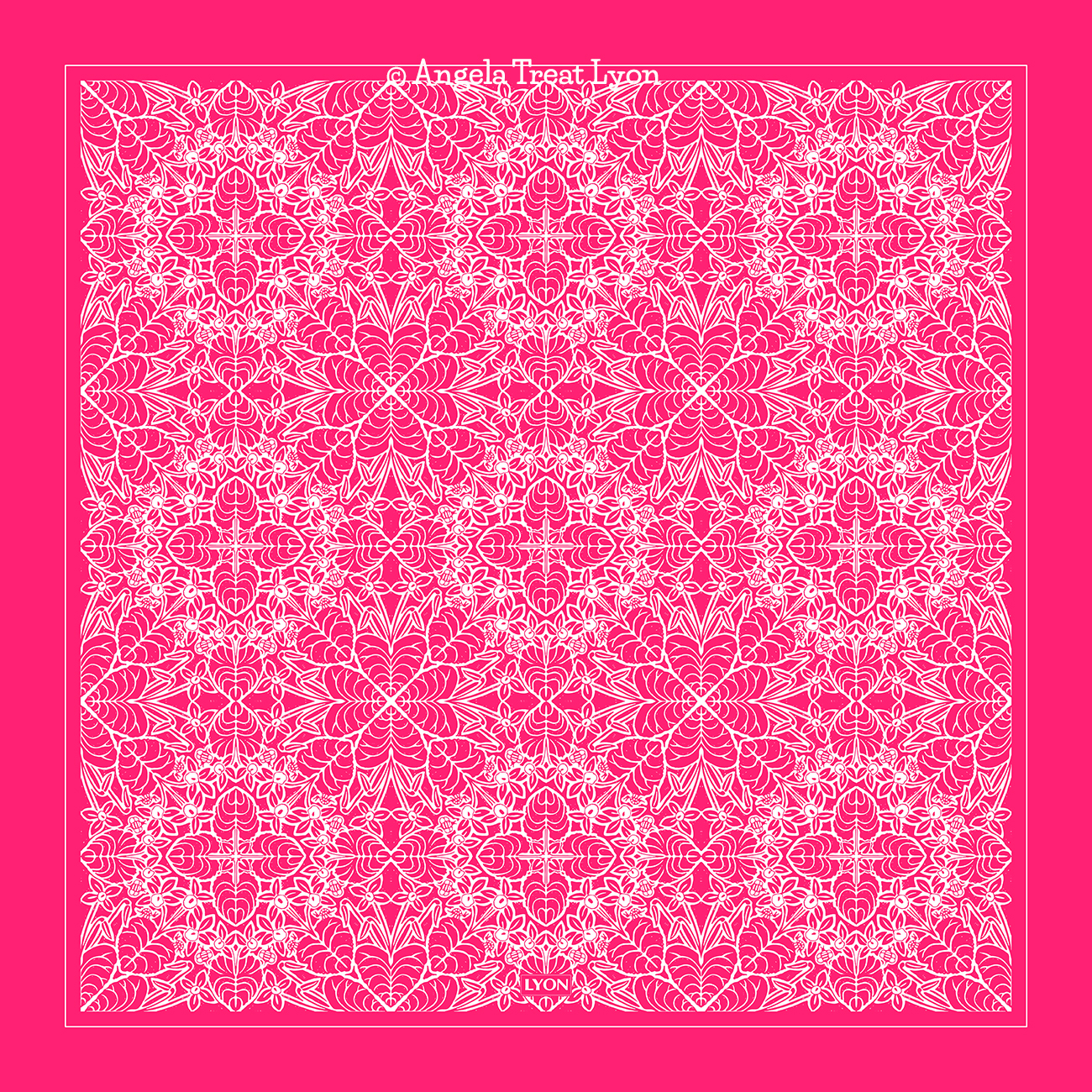
I liked it. So then I did a repeat pattern of it – and I’m in love! I did it first in black and white. Then I thought, oh my, what if it was a coral-ly pink kinda color? So here it is. I think I’m even more in love.
Yeah, I know – it’s still bright! But that’s OK. Maybe my brain just isn’t capable of subtle! Hahahahaha!
-=-=-=-=-=-=-=-
VIOLETS IN CORAL-LY PINK
© Angela Treat Lyon 2024